Coindesk - UX research and online news design
- Category:
- Custom Software Design
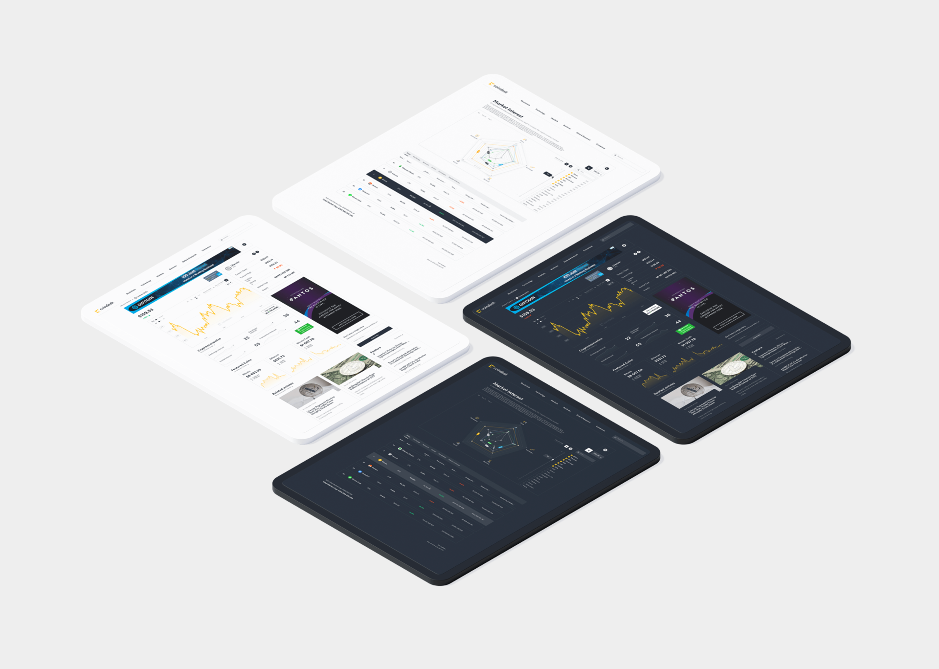


The Tooploox team delivered a subsite redesign, all new pages from scratch, and deepened user research in less than 22 days.
Cryptocurrencies are one of the hottest technology trends in the financial world. According to a study published by the European Parliament, cryptocurrencies are “virtual currencies as digital representations of value, not issued by a central bank, credit institution or e-money institution, which in some circumstances can be used as an alternative to money.”
Currently, there are an estimated 40 million people using blockchain-based wallets, enabling users to keep their currencies like bitcoin in a safe place. According to market estimations, the number of users is growing exponentially with significant spikes whenever the news about a particular currency goes mainstream.
With multiple virtual currencies on the market and a large number of users willing to use or invest in these assets, the need for a reliable source of information about exchange rates or news regarding this market niche has emerged.
The Client
CoinDesk is a leading informational website covering the topic of cryptocurrencies, the market and assets regarding the whole crypto market. The website was launched in 2013 and has a reach of up to one million users every day via multiple channels including social media, email newsletters, podcasts, and videos.
The company is behind the Bitcoin Price Index, a collection of semi-official information about the current exchange rate of bitcoin, the most popular (and the most valuable) cryptocurrency in the world. The metric has been used by multiple media vendors and companies, including The Wall Street Journal, the Financial Times, and CNBC.
The Business Challenge
Due to its growing popularity and user base, the company needed a redesign of one of the core coindesk.com sections and a new one designed from scratch. Also, there was a need for new functionalities and for improvements of the existing ones. But it was not so simple.
-
The company needed insight into its audience and their preferences regarding product design as well as to find opportunities and threats in the website design.
-
The company had a need for both quantitative and qualitative data.
-
Considering the above, there was a strong need for a redesign to support further business development.
The crucial challenge was in spreading the portal’s reach to its full worldwide audience, particularly in collecting the right people for interviews to properly reflect the diversity within the target audience.
And that’s where the specialists from Tooploox came into the game.
Our Work
The newspaper-style website needed to combine content-heavy web design with clarity and legibility. Websites with a lot of content need to keep a clean look while not abandoning the principles of minimalism – no easy task.
Redesign
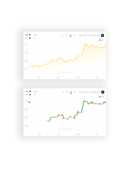
Addressing the needs of the portal’s growing audience required the implementation of new functionalities. First of all, access to new types of data, aimed at more advanced, professional users. The interface had to be clear enough for people who were beginners when it came to price analysis. And at the same time, it needed to allow senior users to find detailed information about price fluctuations.
Also, there was a need for a new subsite that would show a list of cryptocurrencies in an accessible way. Entering a website with a lot of data on display is a challenge from a legibility and accessibility point of view, especially for mobile users.

The Effects
We finished the whole process within 22 days, effectively delivering both the website redesign and the user group research.
The Redesign
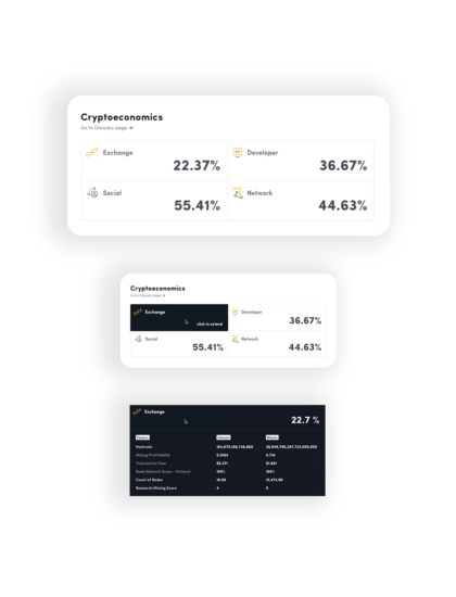
The result of our work was the redesigned Market Interest Page and Pricing Page for mobile and desktop devices. All interfaces were prepared in two color versions – day and night mode.
Also, our team implemented the “spiderweb” graphs which were previously unseen on the portal.
The Report
Additionally, our work resulted in two reports with insights derived from the research and recommendations for interface improvements, 3 user personas, and a video featuring the most significant interview highlights
The report delivered following the research contained (among others):
-
Net Promoter Score metric – how likely was the user to recommend the website to his or her peers.
-
Audience characteristics – including the degree of invested knowledge, attitude toward cryptocurrencies and content preferences.
-
Description of website experience from the users’ perspective – what was good and what required improvements (and more importantly – why).
-
Purpose of the users’ visits – the information they are looking for compared to the information they usually find.
-
User flows – what is the typical journey of the user and why he or she behaves this way.
-
The most valuable and missing content on the site.
-
Mobile experience descriptions.
The report was a ready-to-use document for the UX and UI teams to deliver improvements and redesign the portal.
Additionally, our team delivered a short report with “quick wins.” It contained fixes, changes and tweaks that would deliver the greatest improvements with a minimum amount of work. Our recommendations included some quick tips on news UI design and alterations in the news app layout.
Lessons Learned
The last element of the UX research project should be an analysis that gives the team new insights and highlights what new knowledge has been gathered. In this particular case our most valuable insights included:
-
The possibility to conduct the full UX research remotely, using online tools and apps.
-
The possibility to conduct full-scale research that follows the best practices in less than one month. It is a good point against skipping this phase to make the project cheaper or delivered faster – when using online tools the impact on the final effect is not to be underestimated, while the effort is not that high or costly.
-
Delivering a product to a highly diversified group is challenging. In the end, the effect is universal, yet seems to lack a perfect fit to a particular target group. – However, this can be seen in each of the best news website designs and can be considered “not a bug but a feature.”
-
Delivering a news app UI design is challenging in general. That’s why it was a great project to polish the skills of our design team. They were required to squeeze content, ads and data into a single, clear view. The task being both challenging and rewarding in the end.
Check out our work
DOWNLOAD PDF
Let our specialists solve the problems and tackle the challenges that hold you from conquering the world.
Let’s talk