We’re presenting our brand’s identity update
It’s been over 5 years since Tooploox came into being. Surprisingly, no one pulled out a piece of paper and drew a logo by themselves, which is a common practice in new companies. Instead, we reached out to the professional logo designer, Ivan Bobrov. With prepared mood board on our side, he gave us a few options to choose from. Finally, we picked the trendy one (pay attention everyone! It’s 2014), full of gradation and contours, highlights and shadows.
A brief history of our logo
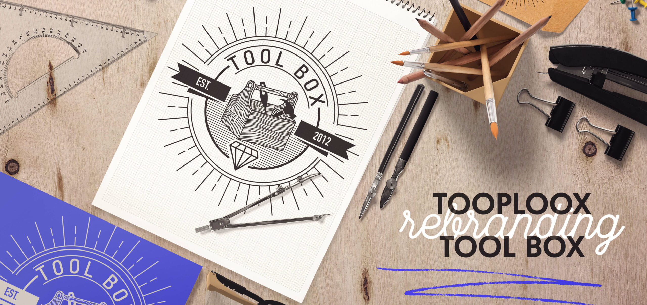
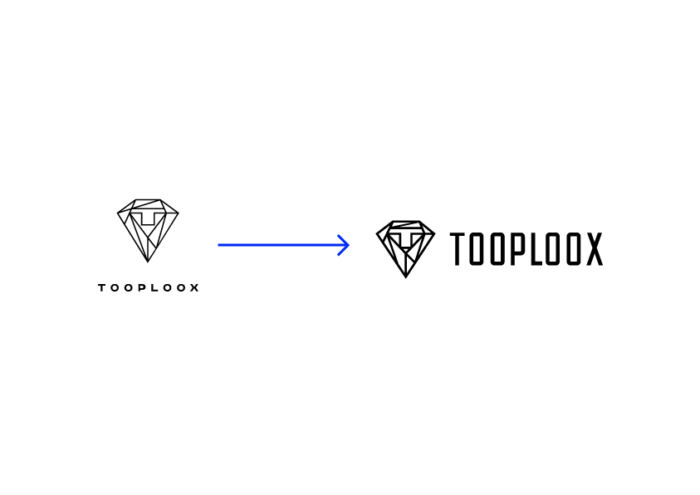
We present our first logo below:
The logo contained three elements that fit the goals of the new company:
- diamond – quality,
- lion – king of mobile apps,
- T – superheroes, T-shaped people, Tooploox
And it just worked. The logo served Tooploox for a long time, but we had some issues with the application and consistency.
The most important problems were:
- the gradient was hard to apply in every printing techniques, e.g. embroidered apparel, embossing, cut-out foils,
- it seemed overcomplicated,
- the scale between the logotype and brand mark was huge,
- the name was very small and wasn’t readable in small applications,
- the sign was illegible in very small sizes – like a favicon,
- the components (diamond and lion) didn’t seem to be aligned with our values and our brand.
Additionally, because it was just a sign, not the whole identity or system, it became hard to come up with the general look and feel of the whole brand.
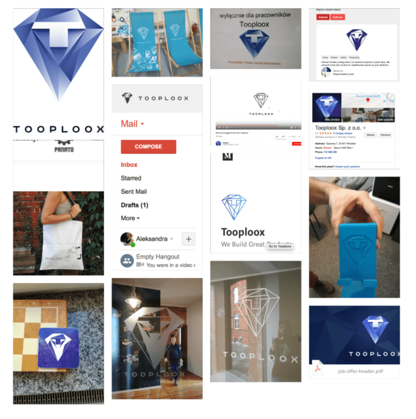
That’s why we created another two versions of the logo – in flat and line styles. There were no usage rules, however, and we ended up with three versions of the same logo. The line version seemed to work better in different applications, but as it was made from the original version, it was still too complicated and the contrast between light lines and bold (but small) letters gave an odd feel. That led to all the inconsistencies you can imagine! Still, as you may expect from a typical fast-growing company, improving branding wasn’t a top priority and there were no people assigned directly to do that.
Yes, we’ve been growing fast. Between 2016 and 2017 we grew from 30 to 100 people. Today we have more than 120 talents! That’s only one of the changes we had to face. We opened a new office, in Gdańsk. And with new talents on board, we extended our portfolio with new services like Blockchain and Robotics. At that point, we could really sit and think who we are, what is our strategy, and why we are doing all this and how.
Can We Change The Logo, Please?
When I joined Tooploox last year as a first graphic designer assigned only to Marketing team, I knew immediately that changes were coming, sooner or later. And after a few months of working with the original CI, we pushed the idea of refreshing our look to the Founders. We knew we needed an easy-to-use, universal logo that will communicate Tooploox brand to our clients and employees.
How are we seen today and how we would like to be seen?
We began by redefining Tooploox branding assets through typical research & analysis, which included:
- Competitive analysis.
- Internal audit analysis.
- Benchmarking aka external research.
- Defining our audience.
What’s tricky about the last part is that we’re one of those companies who have dual audience. On the one side you have a client, on the other – future employees. These are two different groups that require a different language, so we needed to find a perfect balance.
Next, with hours spent on bigger and smaller workshops, we started to define other pieces of Tooploox branding:
Mission:
We establish the partnership with companies by building teams and innovative products in order to solve real-life problems.
Vision:
To provide meaningful, world-class solutions for companies, by creating a work environment where knowledge sharing and application of emerging technologies are the foundations of success.
Tone of voice
a document available to every employee in the company.
So, as we set the good foundations of our work, we knew more where we should head for in terms of visual aspect. The last part was defining the goals of the new branding.
Our challenge was to:
- make our name more visible,
- make the logo and name fit visually,
- make a better use of space (removing unnecessary white space),
- keep the company colors up-to-date,
- keep consistency across all of our branding materials.
…and we picked this line for our inspiration: “An effective logo is not about what one likes or dislikes: it’s about what works.” Sagi Haviv
The deal and some broken rules
After presenting all of the above to the Founders, we agreed on the next steps. We were going to present our logo redesigned on three levels:
- safe option – we aimed at saving the diamond symbol with “t” but balancing it with typography.
- fresh-eye approach – we were going to try to avoid all of the elements used until now and create something new.
- the mix of the above (something old, something new).
We promised to ourselves we would only present the proposals that we strongly believed in after implementing all changes across the company.
And you know what? We failed. We were tempted by this responsibility of creating a new, fresh look of our company. It’s like when you are supposed to be a backup singer but during a show, you push the star off the stage and start performing by yourself.
You know the feeling when you think: ‘this is my time to shine’, right? And then you mess up immediately.
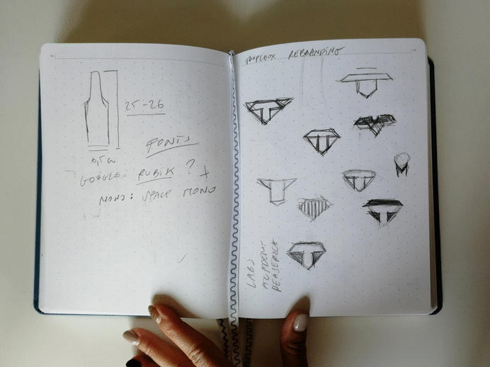
So, we kind of skipped the safe part and we worked only on the fresh approach, without discussing it. Why? Well, we believed that losing the diamond would be the best so we could look for a new, fresh identity. We went crazy and produced a lot of sketches and polished a few ideas. We spend weeks doing it.
And that didn’t work. It’s a good practice not to assume that you, as a designer, will always be right when it comes to aesthetic. The tricky part is that when you are designing for the company you work at, where you work the responsibility for that project has totally different shade. It’s a topic for a separate blog post, but my point is that the client-designer relation is totally different. So you CAN assume that you know something, and you don’t have to check it with decision makers. On top of that, we have a flat structure, which is a lot to tackle when taking that ownership in its full extent.
The landing was quite harsh. We realized that after our presentation the Founders are not ready to let go of a diamond symbol. And We had assumed we could just simply convince them by showing our amazing design, right? Nope. Lesson learned.
Taking a step back
At that point, we had to establish what this symbol means to us, the company and to the Founders. We examined the equity of the existing sign and tried to understand what it symbolizes for the company.
What is surprising and probably unacceptable for most brand designers, taking a step back turned out to be the right thing to do. The boundaries we established with this shape along with the goals led us to the solution that just works, like in that Sagi Haviv’s quote.
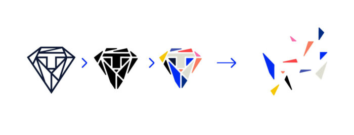
We did another research, dug deeper and discovered that the diamond doesn’t have to be this stereotypical symbol, we can embrace it even more, and use it to tell our own story!
What we strongly believe that the diamond (which is for us a metaphor for Tooploox) is not only precious for our teammates but can also be a treasure for the future employees and a gem for the clients, with whom we create long-lasting relationships.
Moreover, it fits our values and tone of voice. A diamond has many unequaled qualities and is unique among minerals. It’s the hardest known substance – and we believe we are strong as a Tooploox family. A typical clear diamond owes its transparency to its crystal structure, which allows light to pass through it. It reflects transparency in our company, one of the key assets we have. In Tooploox we believe in rough talent and give our employees time to learn and develop new skills.
How we approached *safe mode* redesign
After all that, the work moved fast and we had our clear winner. This is how we came up with the final logotype:
- deconstructing the existing sign,
- changing line thickness of the sign,
- tweaking optical proportions and details
- creating a new font for the name,
- selecting a new font for assets,
- updating the color palette.
We believe we’ve produced the best outcome we possibly could. Taking into account the growth of the company and its position on a business map, it seems to be a perfect solution and tool, which help us achieve even more.
What exactly have we accomplished?
- the name now stands out,
- we’ve balanced the logo with the name,
- more readable, modern and memorable custom font which resonates with emotions,
- new color palette alluding to the old one, but more vivid and energetic,
- we’ve chosen Barlow font family, contemporary sans serif, which helps inject energy and enthusiasm into the entire Tooploox communication as our primary font. It complements the logotype without replicating it,
- design, as a whole, is stronger visually, more impactful, and sets us apart from the competitors.
That’s Not All.
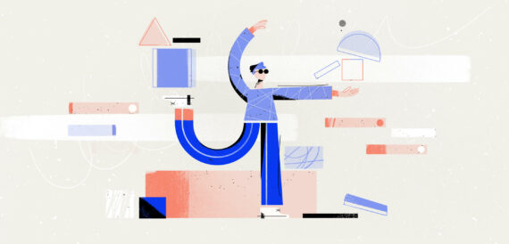
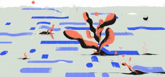
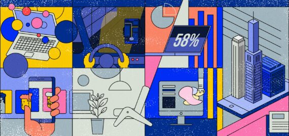
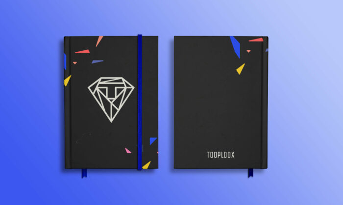
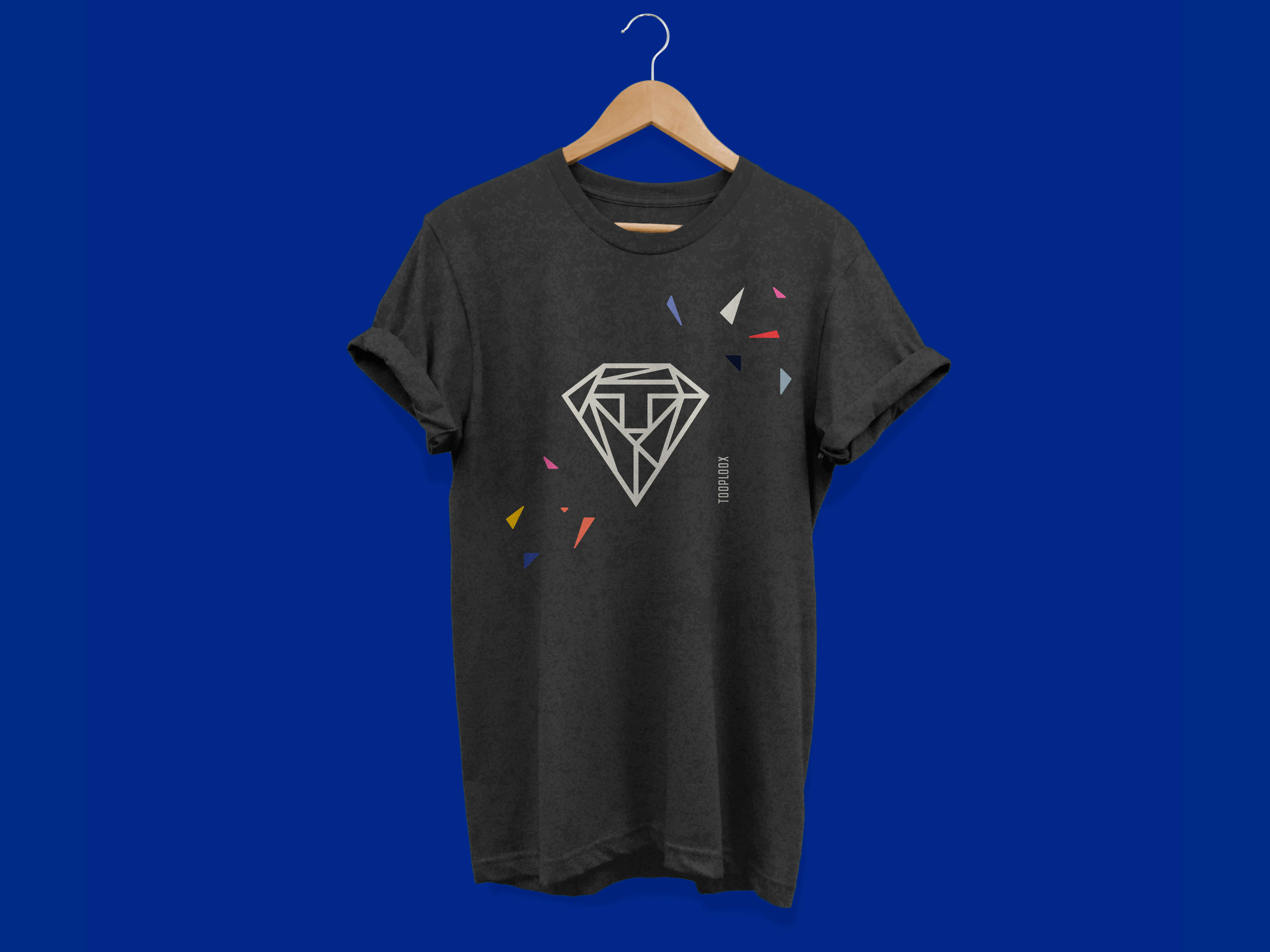
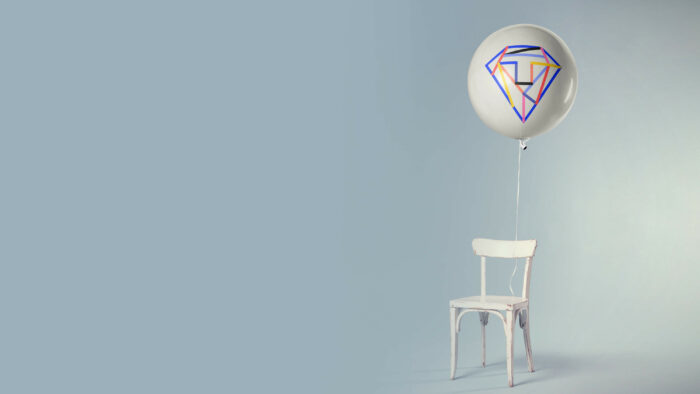
Of course, the logo is only one part. Then, you have a set of assets that build the whole branding along with the strategy. Besides the colors and typography, we’ve created a new visual with endless possibilities that we are excited to discover and implement in our future work!
The idea behind it is to take out elements from the diamond and use them as pieces or puzzles representing the culture of Tooploox. Together with typography and color palette it all will become our cohesive look & feel.
What’s next?
We are a very product focused services company and just like in any product development we iterate. We are taking a similar approach with our branding. Today we are starting mostly on social media, but soon it will appear in the new Swag, external and internal assets and finally (well, priorities, right?) the website! We have a plan for the next few months to come, so the work definitely doesn’t stop here.
The awesome thing about creating a brand for the company you are working at is that you don’t have to hand over the finished design but you can actually continue the project by developing all the assets and watching it grow and expand. Of course, with your focus on every detail.
For now, all of our employees are getting familiar with the available guidelines and templates we have prepared for them on our Wiki page so that everyone has the same idea and knows how to deal with new assets.
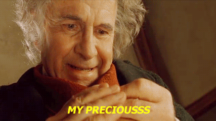
For now, at least, we get to keep our precious diamond.